How many times have you seen a gigantic house and wondered: How can anyone afford a place that expensive?
Plenty, I bet. They may not be in the neighborhood, but you can’t escape the pictures. It’s pretty intimidating to look at a $5 million house, figure a $1 million down payment and a monthly mortgage payment of $21,473. Add the tax bill, the insurance bill, utilities, and maintenance— not to mention those daily flower arrangements in the entry— and you’re talking real money.
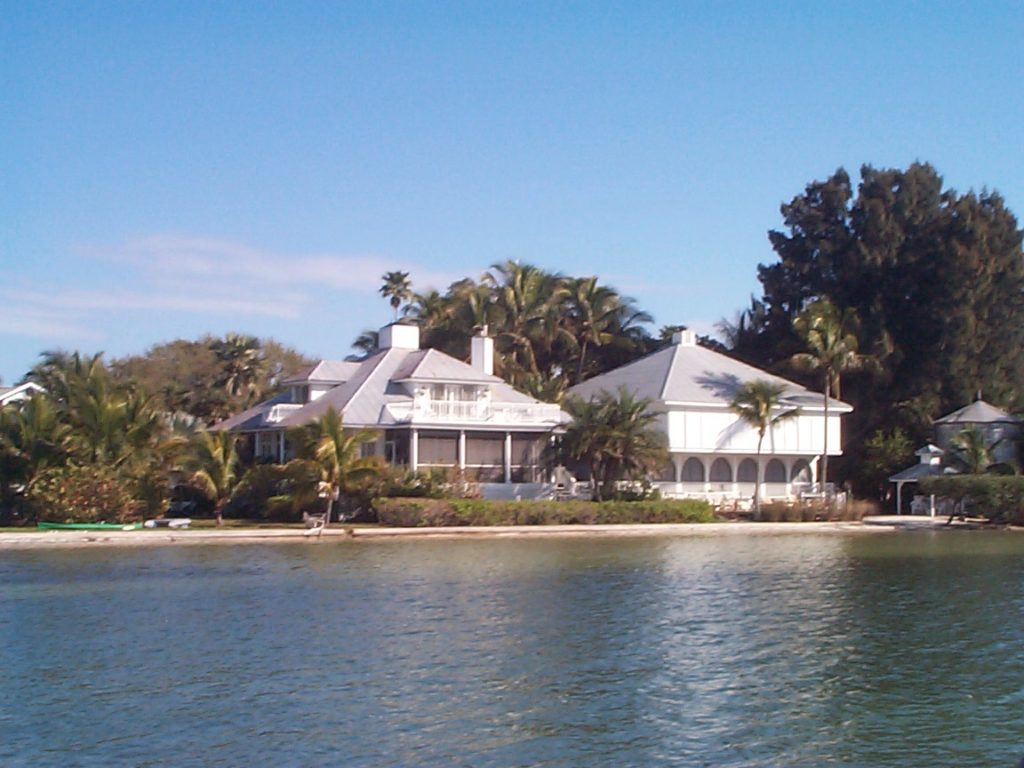
Million dollar houses are just… everywhere
Yet they are surprisingly common. Go to www.realtor.org, for instance, and plug in a $5 million minimum price and you’ll find 138 listings in Aspen and a whopping 208 in Greenwich, the hedge fund capital of America.
What can we learn from this?
A lot. Let’s start by recognizing that there are two kinds of houses in this world. There are paycheck houses. And there are portfolio houses. The kind we see most often is a paycheck house because that’s what most of us own. As the name suggests, a paycheck house is a house you buy with your paycheck, payment by payment. We do that because most of us can’t write a check for a median priced home, $177,900, let alone a $5 million one.
Whether paycheck or portfolio, our houses are important to us. They are also important to the country since most people have more at stake in the housing market than they have at stake in the stock or bond markets.
So let’s see what the statistical tea leaves say about both types of houses in the future.
Paycheck houses. If you take the long view, owning a home is still a good deal. In 1970, at the beginning of a decade of intense inflation and rising interest rates, the median home price was $23,000. By 2009 it was $177,900. Had it risen with the Consumer Price Index, the median home price would now be only $127,190. If you bought before 2004, odds are you have not lost money. Its value is likely to have kept pace with your paycheck— flat.
The people in trouble are those who bought as the bubble was peaking. Even if they were prudent with their financing, they are now upside down. The problem can be aggravated by having borrowed at an interest rate that would reset to a higher rate later, or by having borrowed out some illusory “equity” through a home equity loan. However you view it, it’s a deep hole. Millions of people are in it.
Does that mean homeownership is now a bad deal?
No, but two factors suggest danger and opportunity in the near future. First, it’s going to take time to slog through the inventory— the foreclosures, the no-pay homes that are not yet in foreclosure, and all houses that have been taken off the market until a better day. Like stocks, houses should not be bought to flip. As I pointed out in a 2007 column, the recovery time in the Texas bust of the 1980s was 8 to 11 years. We’re only on year 4, so there’s a lot of slogging left to do.
Second, the most important driver is rising paychecks. Waiting for that to happen could take a while, too.
Portfolio houses. These houses are completely different because they are purchased with a different currency. They are purchased by trading a stock holding for a house holding. As much as anything else, they are a diversification move. Since stock wealth has soared, the number and price of portfolio houses has also soared.
One way to measure this is with the house-to-stock exchange rate. In 1980, after a decade of weak stock prices, it took 50.9 shares of the Wilshire 5000 Index(then 1,221) to buy a median $62,200 house.
By the peak of the Internet bubble market in 2000 you needed only 11.8 shares of the Wilshire 5000 index (at 12,488) to buy a median priced $147,300 house. In other words, if shares of stock were your medium of exchange, the cost of shelter had dropped by 75 percent over the 20-year bull market.
So it’s no surprise that the number of really expensive houses has soared. Today, the house/stock exchange rate isn’t quite as attractive as it was in 2000, but it is still low relative to most of the last 40 years.
Examining the Housing Market |
||||
| This table provides a time series to compare the median U.S. home price with inflation and stocks | ||||
| Year | Median Home Price | Inflation Index | Wilshire 5000 Index | House/Stock Exchange Rate |
| 1970 | $ 23,000 | 100 | 830 | 27.7 |
| 1980 | $ 62,200 | 212 | 1,221 | 50.9 |
| 1985 | $ 75,500 | 277 | 1,924 | 39.2 |
| 1990 | $ 95,500 | 337 | 3,187 | 30.0 |
| 1995 | $112,900 | 393 | 6,057 | 18.6 |
| 2000 | $147,300 | 444 | 12,488 | 11.8 |
| 2005 | $219,000 | 503 | 12,368 | 17.7 |
| 2006 | $221,000 | 520 | 14,068 | 15.7 |
| 2007 | $217,900 | 534 | 15,142 | 14.4 |
| 2008 | $183,300 | 555 | 9,267 | 19.8 |
| 2009 | $177,900 | 553 | 11,103 | 16.0 |
| Sources: NAR, Bureau of Labor Statistics, Yahoo finance | ||||
Related columns:
Scott Burns, “Deja Vu Texas,” 10/05/07
http://assetbuilder.com/blogs/scott_burns/archive/2007/10/05/d-233-j-224-vu-texas.aspx
Sources and References:
National Homes for sale database http://www.realtor.com/
Wilshire 5000 data: http://finance.yahoo.com/q/hp?s=^DWC
BLS inflation calculator http://www.bls.gov/data/inflation_calculator.htm
This information is distributed for education purposes, and it is not to be construed as an offer, solicitation, recommendation, or endorsement of any particular security, product, or service.
Photo: Scott Burns: Florida waterfront houses, Useppa, 2004
(c) A. M. Universal, 2010